
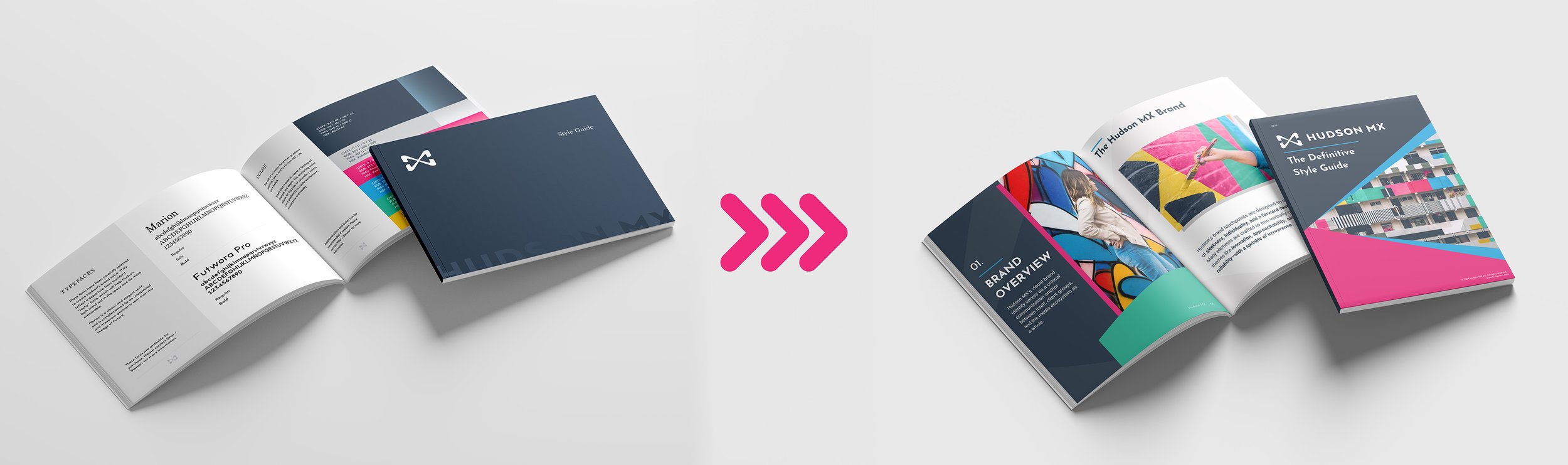
Hudson MX Style Guide & Brand Overhaul
Role: Graphic Designer
Tools: Adobe InDesign, Illustrator, Photoshop, Canva
Objective: Rebuild the company's brand standards from the ground up to reflect their identity as a modern AdTech SaaS platform.
Impact: Authored a definitive 24-page style guide that established rigid usage rules, gutting antiquated aesthetics and driving cross-departmental brand alignment.
When I arrived at Hudson MX, their legacy brand guidelines were suffering from severe internal apathy and a painfully antiquated visual identity. Sitting down with the CMO, I took point on a comprehensive brand modernization initiative. I gutted the outdated aesthetics, established rigid color usage rules, modernized the typography, and authored a 24-page style guide that finally aligned their visual assets with the modern SaaS platform they actually were. It set a hard, definitive standard for everything that followed.
The original style guide used typefaces and color schemes that the marketing department found to be antiquated and unaligned with their identity as a modern software company.
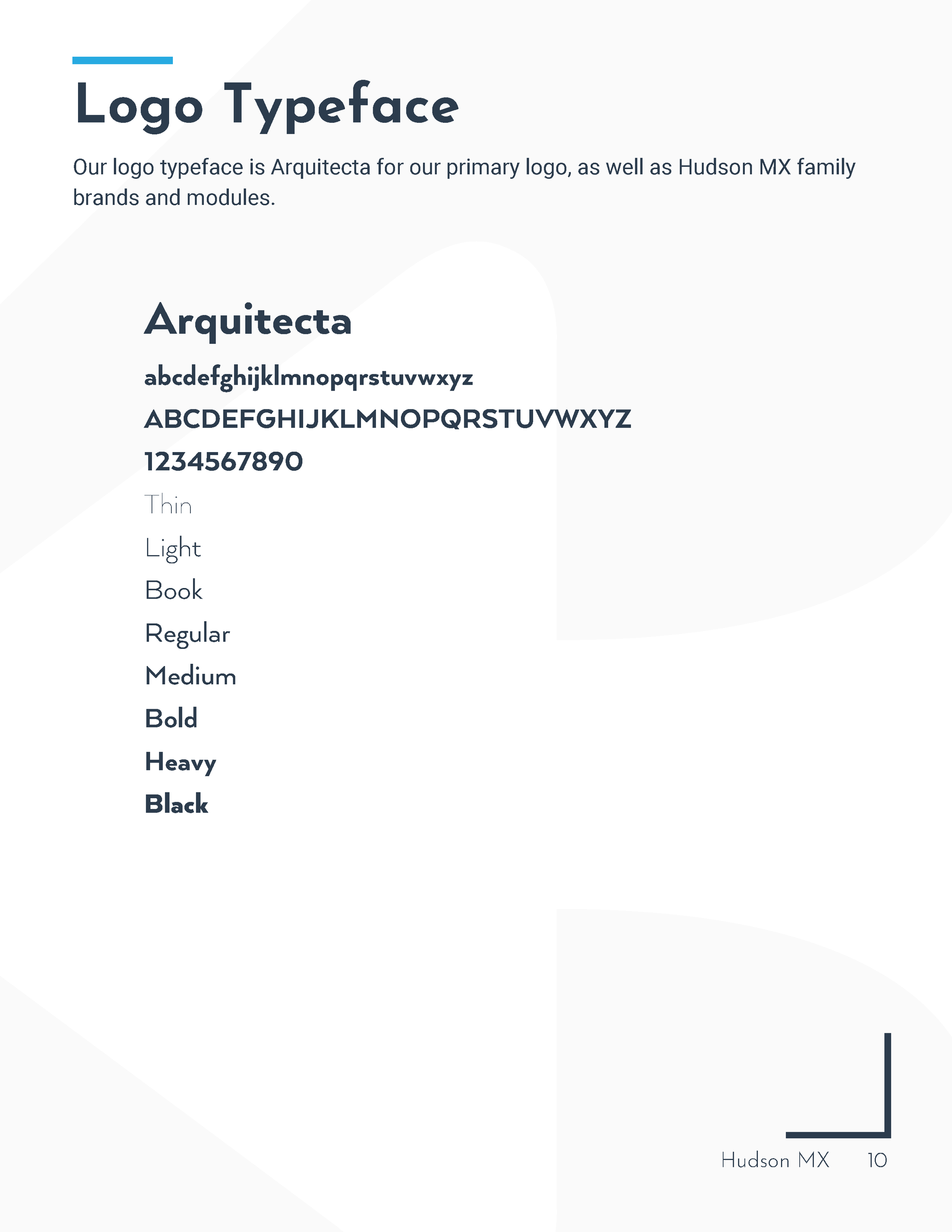
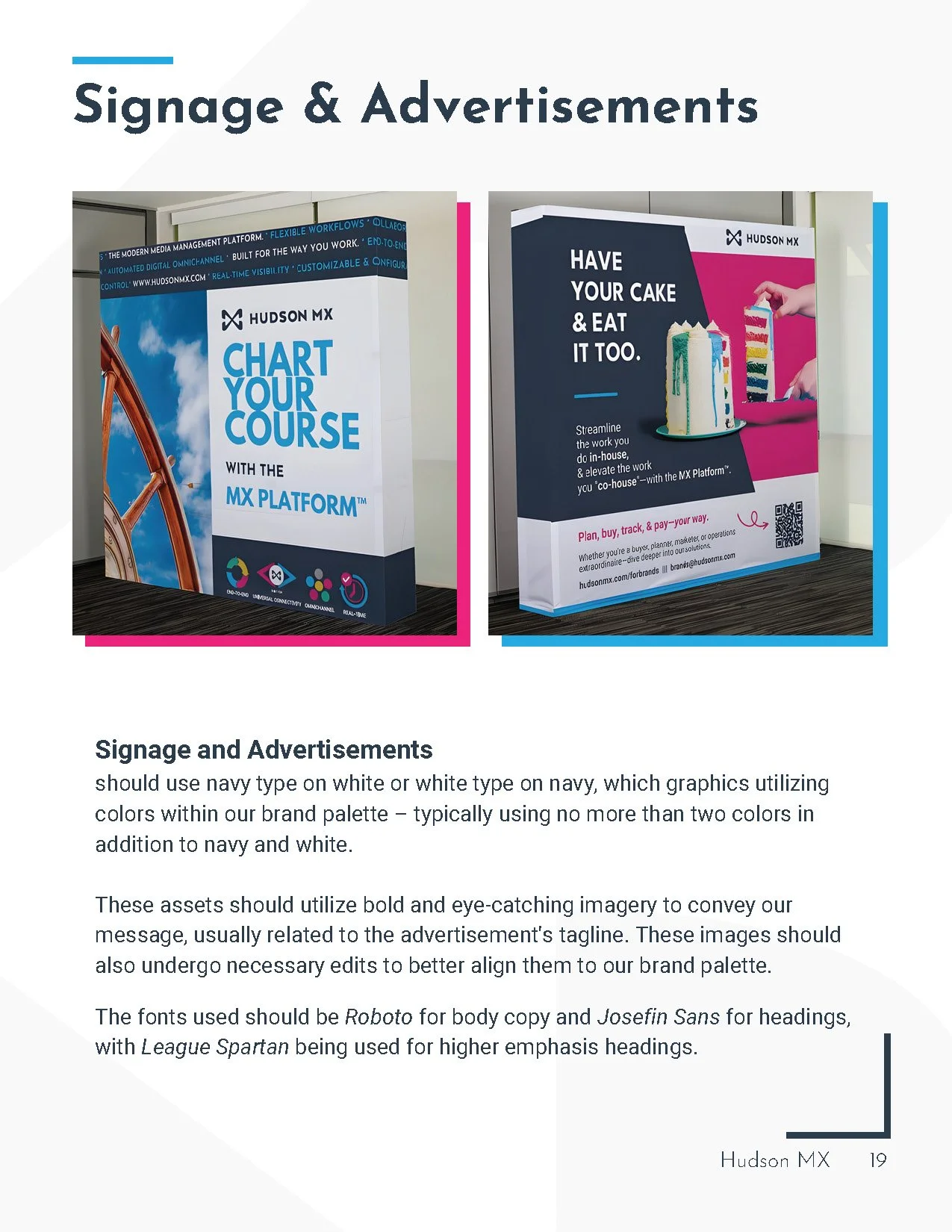
The new guide completely reworked Hudson’s brand identity – utilizing more modern graphics, more rigid color use rules, and fashionable sans serif fonts.

Front Cover

Front Endpaper

Table of Contents






Back Endpaper

Back Cover
Content © Hudson MX Inc.